uupStudio

Web Portal, Kiosk

Product Design

UI / UX

Prototyping

Interaction

Role:

Lead Product Designer

UX Design

Duration:

3 Months

Tools:

Figma, Adobe Suite

What is uupStudio?

uupStudio is a startup that set its sights on breaking into the digital rental space. Their first product being a rooftop space in NYC. They needed to launch the first rental space for proof-of-concept and investor funding.
After a successful internal launch, I led the design and development of the customer-facing app working with the founders and culinary industry professionals for feedback and testing.

My role as a designer

I was brought on as a multidisciplinary designer to develop and prototype the web portal / Kiosk along with spatial design development to prepare the company for MVP launch.

Design Brief

The brief was to prototype and build a web portal for online booking. The design had to work for both web and in-building kiosks for rental bookings, Meaning that a design that could be optimized for an iPad or touch devices was paramount.

Initial explorations didn't match the design brief.

My initial explorations ended up being more traditional layouts.
The designs weren’t quite matching up to the design brief.
They couldn’t work for both Kiosk and web.

Gathering more inspiration

I wanted to go in a new direction and looked to what was happening in design. The rise of ChatGPT, Claude and other AI tools came to mind. With these tools, conversational, one line inputs became more culturally acceptable.

A chance run at Ikea made it click

Their in-store returns kiosk made the rest of the idea snap into place. It serves both web and in-store.

Single-line booking entry

The main input field(s)

Each detail can be entered into the fields without menu surfing, Getting closer to typing with more natural language rather than drop down menus.

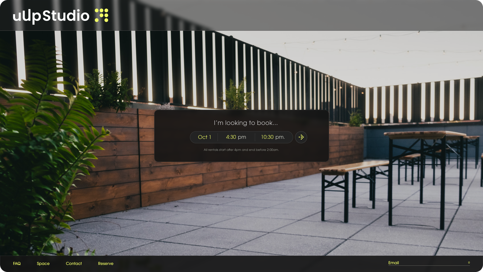
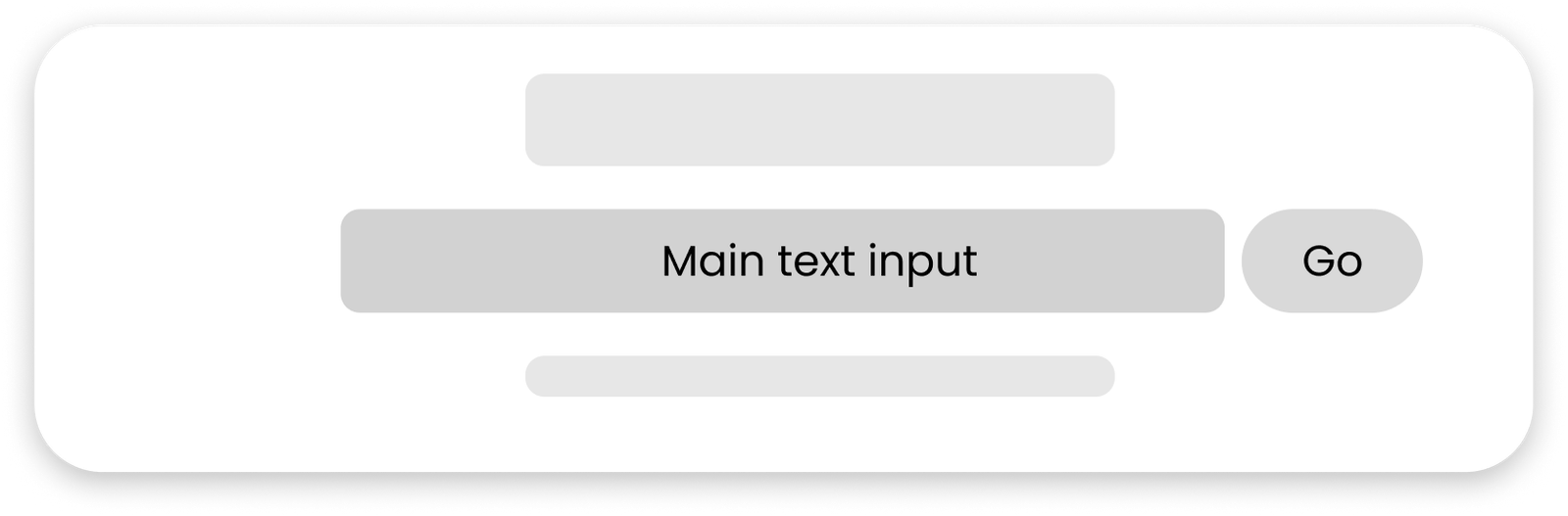
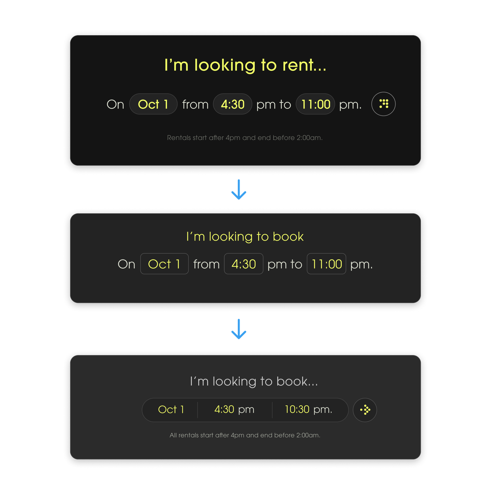
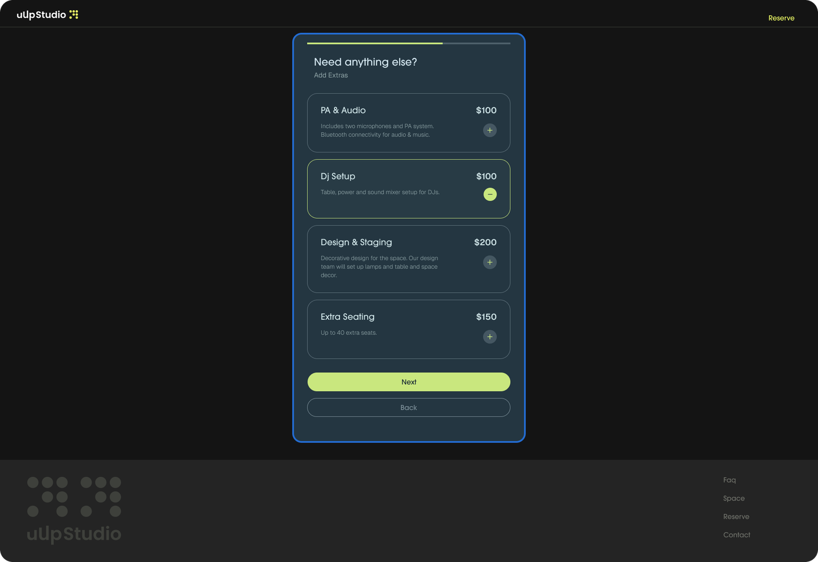
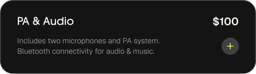
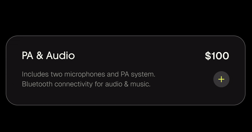
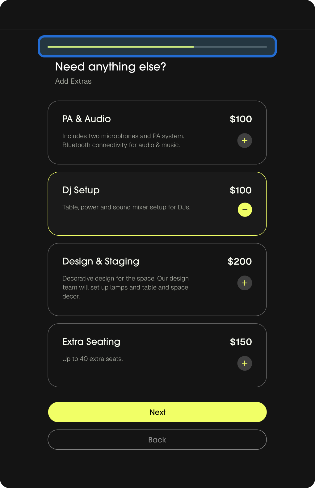
Refining the main input field

After the idea of the input field was accepted, I was able to refine refine the design to be in-line with the established brand identity.
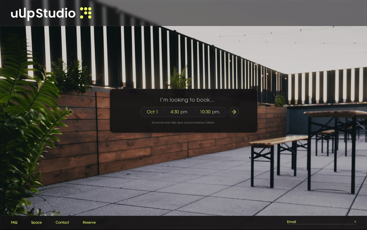
The first iterations had each input field separated within a sentence. This design felt too broken didn’t have the seamless feel we were going for.
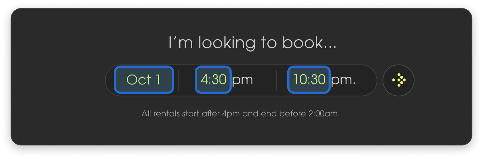
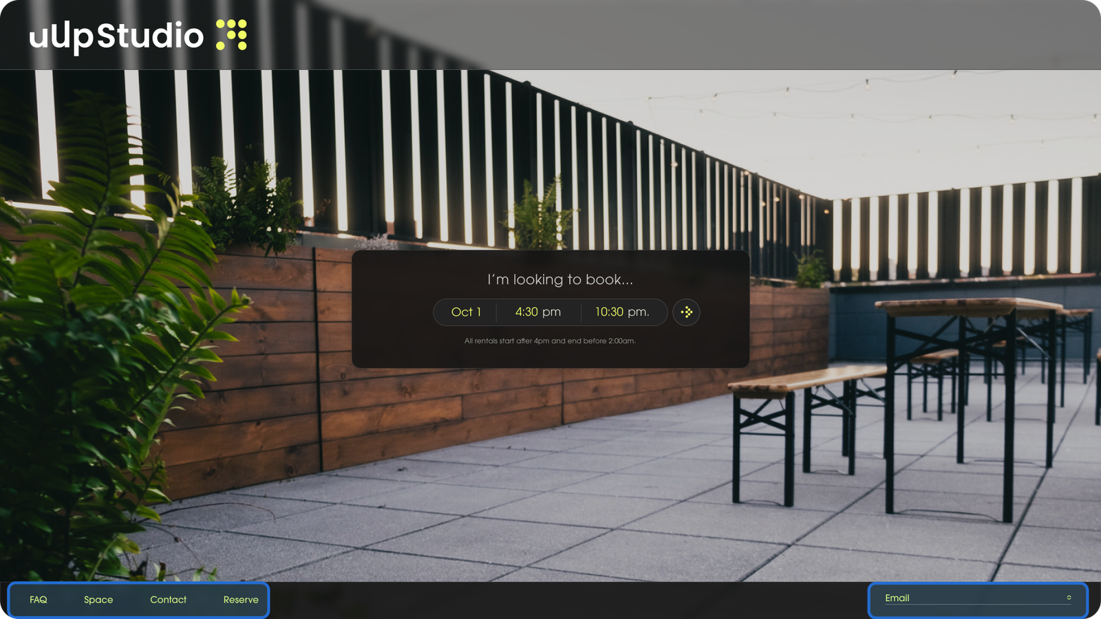
The final draft combined these inputs in one line to make a more cohesive and effective design.

Type in inputs with natural language.

For our inputs, they are typed in with natural language. Type in the times and dat that you want to book.
Invalid values will are shown in red.

A new landing page

Designed it to be clear with minimal distractions from the main purpose of booking. It’s design works for both modalities, satisfying the starting design brief.

Navigation and Email

The nav and additional information were moved to the bottom of the page, still acessible, but serve as contecxt for the primary goal: booking.

Centerlined Design

Each successive page is designed to be centerline, ensuring visual clarity for all modalities of operation.
The design easily adapts for in-house applications.

Card Design & Interaction

‘Additional item’ Cards are optimized for both desktop and tablet in one design.

On Click / Press

When the item is selected, we change to a lighter background with a the brand highliter green outline.
Our button animates to ‘deselect’ by rotating the plus icon and changing to a minus icon. The color is changed to show change of state

Status Bar

A status bar was introduced to give indication to how close customers are to competing their booking process.

Three Page Flow

From the initial booking information on the landing page, we go straight into additions and then move on to the final checkout. Clear, concise, intuitive.

Results

Successful 0-1 MVP launch.

40

40 bookings within 3 months of launch

Simplified System

Customers found the booking system faster and easier than many traditional booking systems on other platforms.

Key Takeaways

Functional Design

With this project, I was able to create a hyper-focused, purposeful design. By focusing on function i was able to have a less stressful design experience for this fast paced development.

Iterate Faster

I can’t linger on certain design decisions for too long. The faster a designer can iterate, the faster you can get to something that works.